
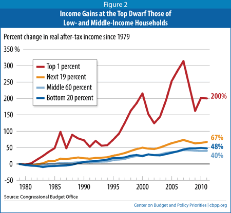
Income gains of the top 1%, the next 19%, the middle 60% and the bottom 20% of the income distribution (after taxes and adjusted for inflation):
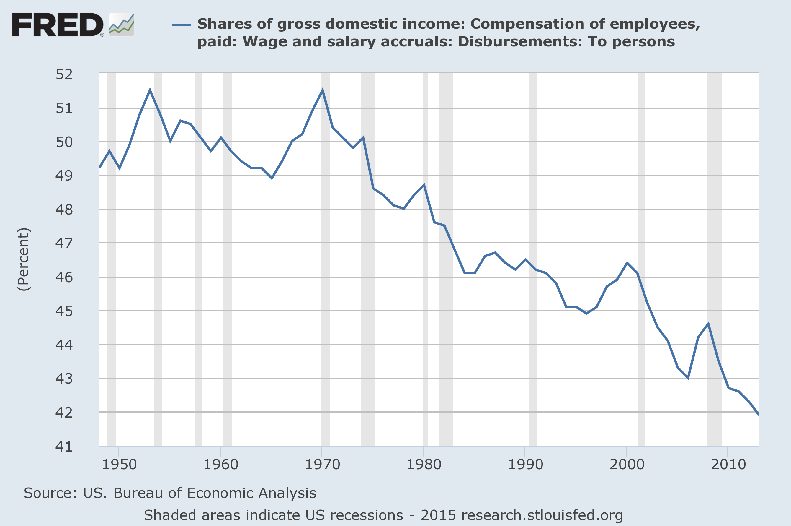
And percentage of income from wages since 1950 (an indicator of the extent to which people earn their living through work as opposed to investments and other types of income):
Meanwhile, real (inflation adjusted) GDP has grown by a factor of ~2 over the past thirty years:
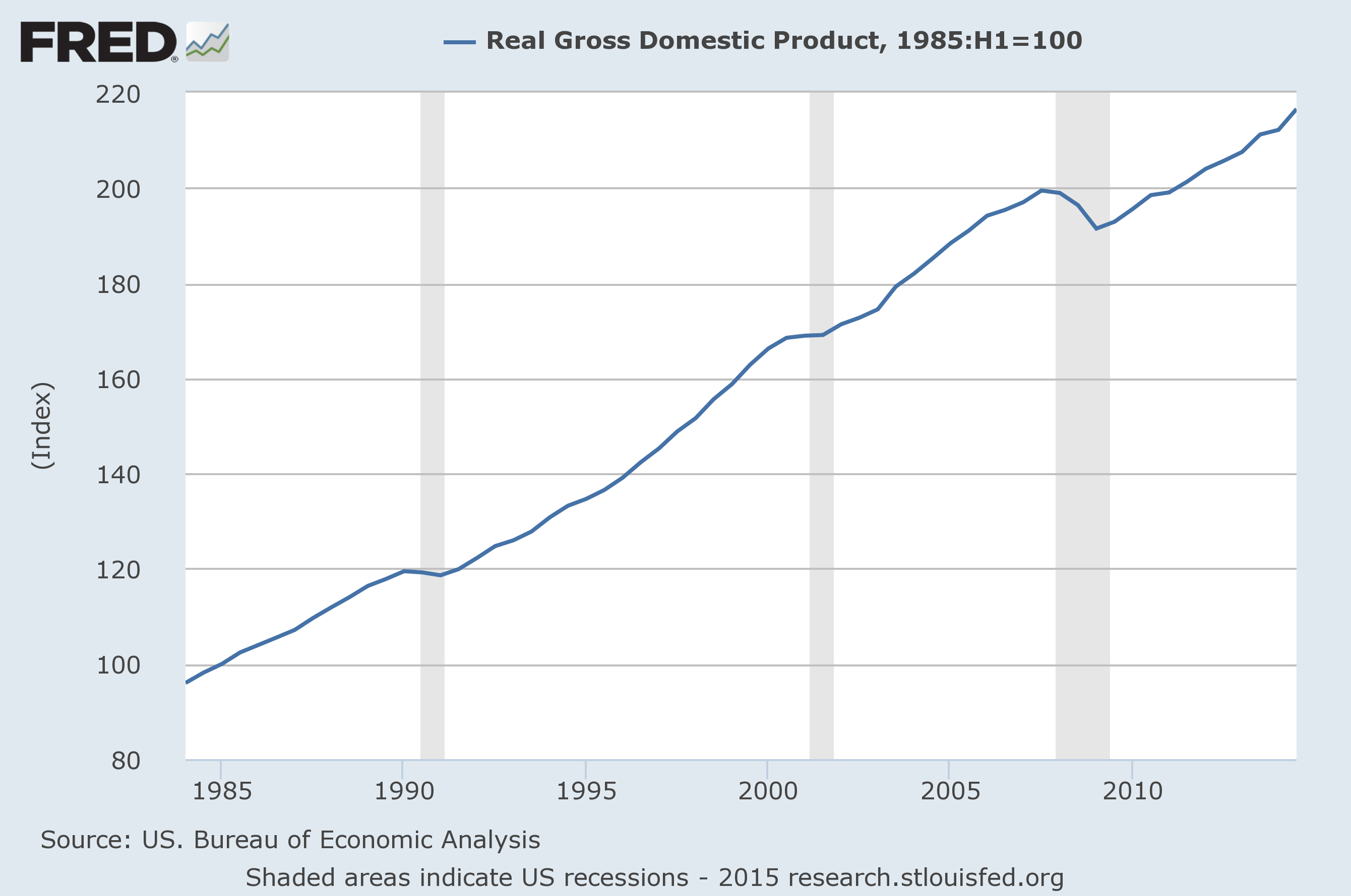
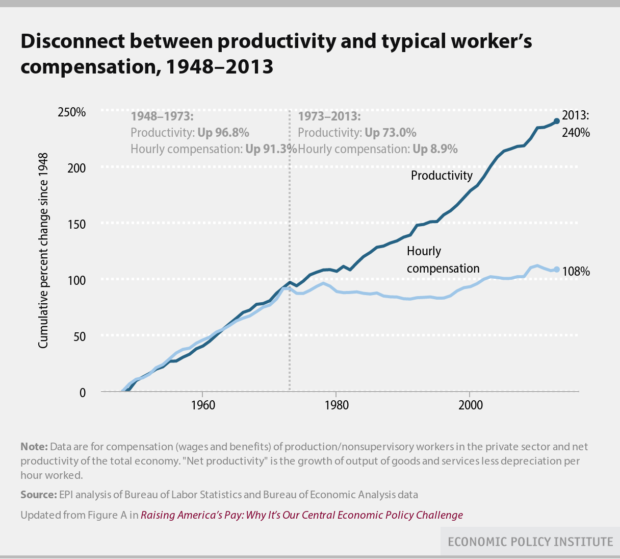
For those keeping score at home, the chart above indicates that if GDP gains were distributed evenly across the population everyone’s real income would have gone up by a factor of ~2. (That’s consistent with the productivity increase plotted in the first chart.) However, that’s not the case. Here’s wealth vs time for the top 1% of earners and the bottom 90% of earners:
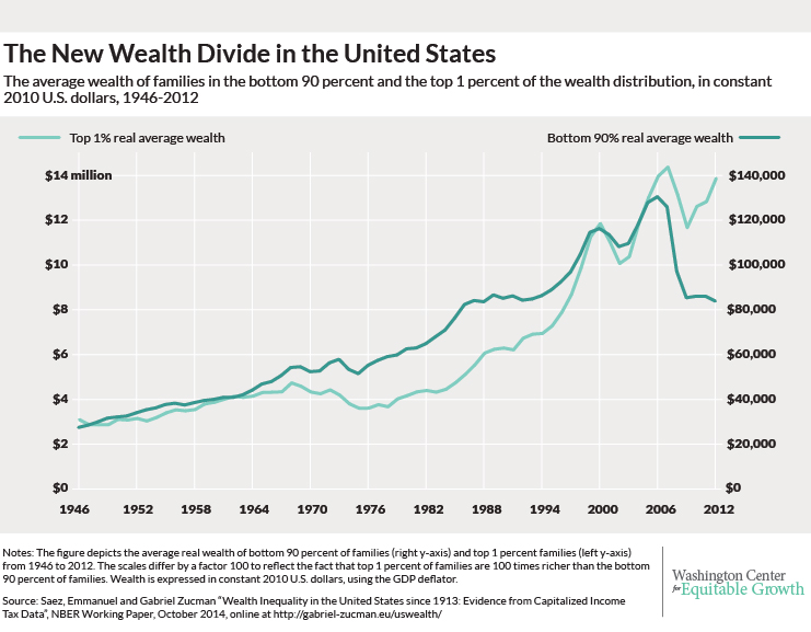
Note the 100x difference in scales between the left and right axis as well as the relative changes in wealth over the past 20-30 years. Rather than a factor of two increase, the bottom 90% has realized no increase over the past ~30 years. In contrast, rather than increasing by a factor of ~2, the wealth of the top 1% has tripled over that same period. That’s right, the top 1% hoovered up all of the GDP gains over the past thirty years and then some.
So, how’s that Reaganomics neoliberalism working out for you?