The graph below shows the Employment-to-Population Ratio and Labor Force Participation percentage for people ages 25 thru 54. You tell me, does it look like an indicator of a healthy economy?
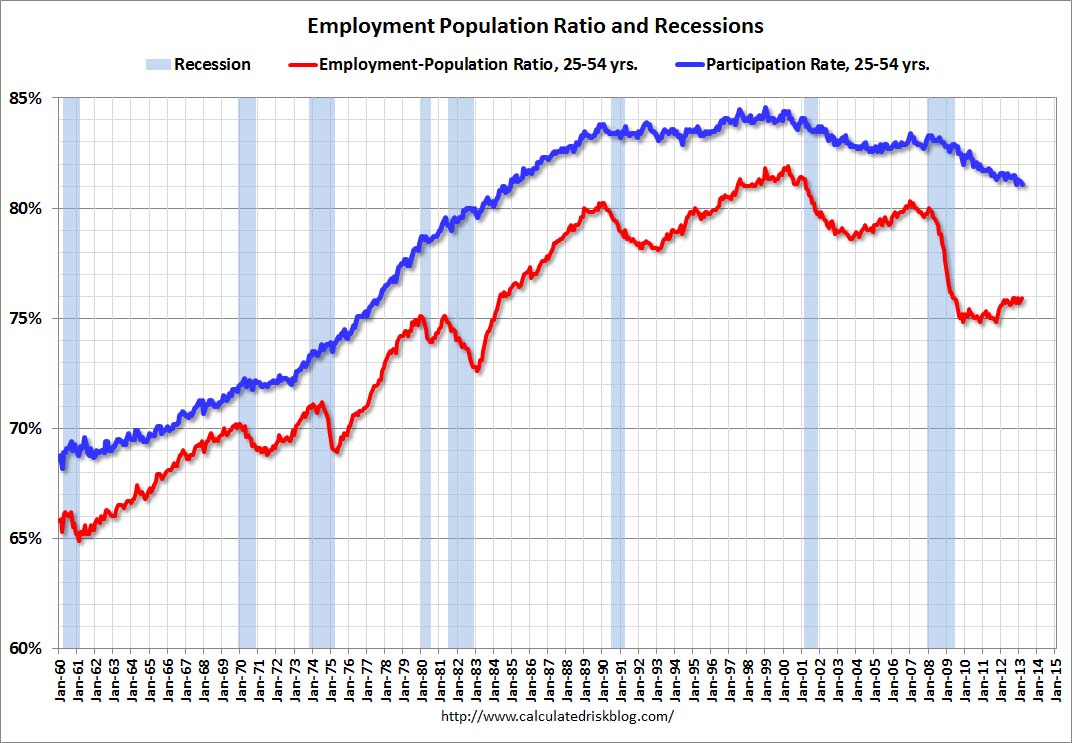
See Calculated Risk for discussion.

The graph below shows the Employment-to-Population Ratio and Labor Force Participation percentage for people ages 25 thru 54. You tell me, does it look like an indicator of a healthy economy?
See Calculated Risk for discussion.