On fitting data to a model

Gavin Schmidt on data modeling in general and on modeling for climate science in particular, On mismatches between models and observations:

Just as no map can capture the real landscape and no portrait the true self, numerical models by necessity have to contain approximations to the complexity of the real world and so can never be perfect replications of reality. [Note:  I had a stat mech professor who liked to say that “The difference between physicists and physical chemists is that physical chemists know when to approximate.”  I am a physical chemist.]  Similarly, any specific observations are only partial reflections of what is actually happening and have multiple sources of error. It is therefore to be expected that there will be discrepancies between models and observations. However, why these arise and what one should conclude from them are interesting and more subtle than most people realise. Indeed, such discrepancies are the classic way we learn something new – and it often isn’t what people first thought of.

The first thing to note is that any climate model-observation mismatch can have multiple (non-exclusive) causes which (simply put) are:

1.  The observations are in error

2.  The models are in error

3.  The comparison is flawed

He then touches on observational error, modeling error, and flawed comparison and suggests implications:

Continue reading

Understanding the Oregon Medicaid experiment: Part 4

UPDATED 5/25/2013

Part 4 – in which I believe I make progress in understanding the details but still end up wrapped around the axle.

First off, but having nothing directly to do with the NEJM paper, I understand significantly more about logistic regression than I did a week ago.  I’m used to thinking about continuous variables.  Logistic regression facilitates modeling of binary outcomes, i.e., enables you to predict the probability of an outcome being true (or false) given a particular set of conditions which affect the outcome.

Under the logit model, the probability of an outcome being true given a set of conditions defined as vector  \mathbf{x} is:

(1)    \begin{equation*} p(\mathbf{x}) = \frac{1}{ 1+exp(- \mathbf{x}^{T} \mathbf{b} )} \end{equation*}

The vector  \mathbf{x} consists of m elements whose values are the independent variables which affect the outcome.  For example, in the Oregon Medicaid experiment, p could be the probability of elevated GH level in an individual and the elements of  \mathbf{x} could be ones or zeros depending upon whether the individual had Medicaid, was a member of a one-person household, a two-person househol, liked dogs, stated that pancakes were their favorite breakfast food, etc.  (The last two are intentionally silly – I made them up – but you get the idea,  \mathbf{x} is a vector which describes the “state” of the individual.)  The vector  \mathbf{b} consists of the sensitivities of the probability to the independent variables in  \mathbf{x} .  Our goal is to determine the ‘best’ values of the fit coefficients and the accuracy of the logistic regression model.

Continue reading

Confidence Limits

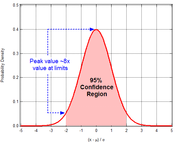
Bear in mind that when someone reports the 95% confidence range associated with an estimated value that all values within that range are not equally probable.  The probability of the true value being in the middle of the range is about eight times greater than the probably that it’s equal to one of the limits.  Here’s a normal-distribution function to illustrate:

pdf_g1

Understanding the Oregon Medicaid experiment: Part 3

In thinking about it a bit more and reading the Supplemental Appendix, I realize that this is a logistic regression problem as much as it is an exercise in Bayesian analysis.  (The Supplemental Appendix suggests that they’re using linear regression instead of logistic regression – which puzzles me.) That said, if the particulars of your analysis involve a small number of binary independent variables (i.e.., lottery winner/loser, on Medicaid/off Medicaid) and no continuous independent variable then it also seems like it would be easy to recast the logistic regression problem as a linear regression problem – need think more about that though.

In terms of analyzing the data, I’d combine logistic regression with bootstrapping to get uncertainties in estimated probabilities (and differential probabilities) of outcome with and without treatment.   From there you should be able to get the ‘overlap of pdfs’ approach I described in my previous post.  Although the details aren’t clear to me yet, I think this (if I follow through on it) will turn out to be complementary to Steve Pizer and Austin Frakt’s “Loss of Precision with IV” calculation.

UPDATE:

Continue reading

Understanding the Oregon Medicaid experiment: Part 2

Part 2 – in which I acknowledge an embarrassing misunderstanding of the data.  Yeah, about that…  My previous post about how the proper way to assess Medicaid’s effect on patient-level quantities like GH level would be to examine a correlation plot of GH levels and the start and end of the experiment?  Can’t be done.  Can’t be done because there is no baseline data.  It’s right there in the Methods summary:

Approximately 2 years after the lottery, we obtained data from 6387 adults who were randomly selected to be able to apply for Medicaid coverage and 5842 adults who were not selected. Measures included blood-pressure, cholesterol, and glycated hemoglobin levels…

I just presumed there was baseline data.  Nope.  Reading comprehension shortcoming on my part.  (Thanks to Austin Frakt and the lead study author Katherine Baicker for politely pointing that out to me.  Yah.  Nothing like demonstrating one’s ignorance in front of people who know what they’re doing.  Moving on…)  Lack of baseline data certainly complicates interpretation of the t=2 years data.  I maintain that comparison of before and after measurements is what you’d like to use as the basis for your conclusions but, to appropriate a line from Rumsfeld, “You analyze the data you’ve got not the data you’d like to have.”

[ADDENDUM:  I’m also reminded of John Tukey’s line:  “The combination of some data and an aching desire for an answer does not ensure that a reasonable answer can be extracted from a given body of data.”]

Continue reading

Understanding the Oregon Medicaid experiment: Part 1

Several weeks ago a paper came out in the New England Journal of Medicine, The Oregon Experiment – Effects of Medicaid on Clinical Outcomes.   The paper isn’t preceded by an abstract per se but there are several paragraphs of top-level introductory information:

Background

Despite the imminent expansion of Medicaid coverage for low-income adults, the effects of expanding coverage are unclear. The 2008 Medicaid expansion in Oregon based on lottery drawings from a waiting list provided an opportunity to evaluate these effects.

Methods

Approximately 2 years after the lottery, we obtained data from 6387 adults who were randomly selected to be able to apply for Medicaid coverage and 5842 adults who were not selected. Measures included blood-pressure, cholesterol, and glycated hemoglobin levels; screening for depression; medication inventories; and self-reported diagnoses, health status, health care utilization, and out-of-pocket spending for such services. We used the random assignment in the lottery to calculate the effect of Medicaid coverage.

Results

We found no significant effect of Medicaid coverage on the prevalence or diagnosis of hypertension or high cholesterol levels or on the use of medication for these conditions. Medicaid coverage significantly increased the probability of a diagnosis of diabetes and the use of diabetes medication, but we observed no significant effect on average glycated hemoglobin levels or on the percentage of participants with levels of 6.5% or higher. Medicaid coverage decreased the probability of a positive screening for depression (−9.15 percentage points; 95% confidence interval, −16.70 to −1.60; P=0.02), increased the use of many preventive services, and nearly eliminated catastrophic out-of-pocket medical expenditures.

Conclusions

This randomized, controlled study showed that Medicaid coverage generated no significant improvements in measured physical health outcomes in the first 2 years, but it did increase use of health care services, raise rates of diabetes detection and management, lower rates of depression, and reduce financial strain.

Not surprisingly, their conclusions have inspired much commentary in the blogosphere and, perhaps more importantly, amongst those interested in formulating good public policy.  If it’s true that Medicaid coverage doesn’t yield “significant” improvements in physical health outcomes that has tremendous consequences.  NB:  The authors conclude that coverage results in “significant” improvements in non-physical outcomes so even if there were no impact on physical outcomes one might argue that Medicaid coverage is beneficial.  (I put “significant” in quotes in the preceding sentences because it’s being used by the authors as a term-of-art.  More on that below.)

After reading multiple commentaries (see, for example, ones by Kevin Drum, Aaron Carroll and Austin Frakt, and Brad DeLong) I decided to cough up the $15 and download a copy of the paper for myself.  I found it frustrating for two reasons:

  1. How the authors chose to present their conclusions
  2. The authors’ criteria for declaring a result “significant”

The second issue is the easiest to speak to so I’ll address it first.  Continue reading

How to analyze data properly: Part 2 in a continuing series

Dave Giles is a Professor of Economics who specializes in econometrics.  I read his blog periodically because some of the mathematical methods he uses in his work are relevant to my own.  A few weeks ago he noted a paper by David F. Hendry and Felix Pretis, Some Fallacies in Econometric Modelling of Climate Change.  It got my attention because it had “climate change” in the title.  It’s a gem.  That said, its relation to climate change research is incidental as to why it is.  What makes it a great paper is that Hendry and Pretis (hereafter HP) articulate the essential elements of proper data analysis.  They illustrate how a conclusion can be both “statistically rigorous” and utter nonsense.  More significantly, they provide a checklist of potential pitfalls to avoid in order for your conclusions to hold up.  NB:  Evaluating your own work to establish that you didn’t make one of the critical mistakes on their list is often very challenging.  Having a checklist doesn’t make the evaluation any easier but it’s nice to have a reminder of the types of errors in thinking that you should be looking for.

Continue reading

How not to analyze data: Reinhart/Rogoff edition

I’m not much for writing this evening so I’ll outsource most of this.  To Doug Muder for the intro:

“[Last week] a controversy broke out in economics, and it actually deserves your attention. A paper that has had a major influence on public policy around the world turns out to be wrong. And not just wrong in a subtle way that only geniuses can see, or even wrong in an everybody’s-human way that you look at and say, “Oh yeah, I’ve done that.” This one was wrong in three different ways that make you (or at least me) say, “That can’t be an accident.”

The bogus paper came out in 2010: “Growth in a Time of Debt” by Carmen Reinhardt and Ken Rogoff (both from Harvard). The paper that refutes it appeared last Monday: “Does High Public Debt Consistently Stifle Economic Growth? A Critique of Reinhart and Rogoff“ by Thomas Herndon, Michael Ash, and Robert Pollin (all from the University of Massachusetts).

Handoff to Paul Krugman:

The intellectual edifice of austerity economics rests largely on two academic papers that were seized on by policy makers, without ever having been properly vetted, because they said what the Very Serious People wanted to hear.  [One of those papers] was Reinhart/Rogoff on the negative effects of debt on growth. Very quickly, everyone “knew” that terrible things happen when debt passes 90 percent of GDP.

Some of us never bought it, arguing that the observed correlation between debt and growth probably reflected reverse causation. But even I never dreamed that a large part of the alleged result might reflect nothing more profound than bad arithmetic.

But it seems that this is just what happened. Mike Konczal has a good summary of a review by Herndon, Ash, and Pollin.

Long story short, Reinhart and Rogoff (RR) screwed up the Excel spreadsheet they used to derive their conclusions.  RR’s conclusion that ohmygodwereallgonnadie if debt exceeds 90% of GDP?  Invalid.  They used the wrong numbers omitted some critical data from their analysis.

Continue reading