
Several weeks ago a paper came out in the New England Journal of Medicine, The Oregon Experiment – Effects of Medicaid on Clinical Outcomes. The paper isn’t preceded by an abstract per se but there are several paragraphs of top-level introductory information:
Background
Despite the imminent expansion of Medicaid coverage for low-income adults, the effects of expanding coverage are unclear. The 2008 Medicaid expansion in Oregon based on lottery drawings from a waiting list provided an opportunity to evaluate these effects.
Methods
Approximately 2 years after the lottery, we obtained data from 6387 adults who were randomly selected to be able to apply for Medicaid coverage and 5842 adults who were not selected. Measures included blood-pressure, cholesterol, and glycated hemoglobin levels; screening for depression; medication inventories; and self-reported diagnoses, health status, health care utilization, and out-of-pocket spending for such services. We used the random assignment in the lottery to calculate the effect of Medicaid coverage.
Results
We found no significant effect of Medicaid coverage on the prevalence or diagnosis of hypertension or high cholesterol levels or on the use of medication for these conditions. Medicaid coverage significantly increased the probability of a diagnosis of diabetes and the use of diabetes medication, but we observed no significant effect on average glycated hemoglobin levels or on the percentage of participants with levels of 6.5% or higher. Medicaid coverage decreased the probability of a positive screening for depression (−9.15 percentage points; 95% confidence interval, −16.70 to −1.60; P=0.02), increased the use of many preventive services, and nearly eliminated catastrophic out-of-pocket medical expenditures.
Conclusions
This randomized, controlled study showed that Medicaid coverage generated no significant improvements in measured physical health outcomes in the first 2 years, but it did increase use of health care services, raise rates of diabetes detection and management, lower rates of depression, and reduce financial strain.
Not surprisingly, their conclusions have inspired much commentary in the blogosphere and, perhaps more importantly, amongst those interested in formulating good public policy. If it’s true that Medicaid coverage doesn’t yield “significant” improvements in physical health outcomes that has tremendous consequences. NB: The authors conclude that coverage results in “significant” improvements in non-physical outcomes so even if there were no impact on physical outcomes one might argue that Medicaid coverage is beneficial. (I put “significant” in quotes in the preceding sentences because it’s being used by the authors as a term-of-art. More on that below.)
After reading multiple commentaries (see, for example, ones by Kevin Drum, Aaron Carroll and Austin Frakt, and Brad DeLong) I decided to cough up the $15 and download a copy of the paper for myself. I found it frustrating for two reasons:
- How the authors chose to present their conclusions
- The authors’ criteria for declaring a result “significant”
The second issue is the easiest to speak to so I’ll address it first. The authors declare a result to be “significant” not because of a qualitative assessment of significance but because their null hypothesis, i.e., the hypothesis that the effect of interest is not present in the sample, can be rejected with >95% confidence. As I noted in my Thought for the Day, choosing 95 percent confidence as the threshold for statistical significance is 100 percent arbitrary. Why choose 95 pct? Why not 94.3 pct? Or 82 pct? The answer is that 95 pct is convention. I see the argument for selecting a particular threshold for statistical significance if you have to automate the analysis process but it makes no sense to me for a human-in-the-loop analysis where the goal of the study is (or at least should be) to generate insight.
Casting conclusions in terms of statistical significance can be less than instructive. For example, suppose your data model is y=ax+b. I’d argue that what’s instructive are the estimates of a and b as well as the associated uncertainties and covariance. Reducing the analysis to “Our analysis indicates that a is not significantly different from zero.” risks blowing away useful information. With respect to the Oregon Medicaid experiment, it seems to me that we should be interested in are the actual probability distribution functions of outcomes, i.e., p(change in outcome X|treatment) and p(change in outcome X|no treatment). Better yet, compute some more sophisticated pdfs – for example, compute the pdf that Medicaid-funded treatments reduce glycated hemoglobin levels by >Y% in patients who initially had elevated levels and compare that pdf against the one for the untreated population. Bottom line: Look at the data. What does it tell you? That’s where the discussion should be focused. That’s a segue to my second complaint.
I’ve never read a medical journal paper before let alone a paper from NEJM so perhaps my frustration is due solely to the fact I’m an outsider. I understand the general flavor of the analysis but the specifics fall outside my realm of expertise. I realize that not every paper will be a tutorial but I was hoping that the paper would provide sufficient detail that I could “bootstrap” up to a deeper level of understanding. So far that’s proving difficult. To some degree – perhaps entirely – it’s a matter of how the authors choose to present their results. The process by which they drew conclusions from data is opaque. The statement
Analyses were performed with the use of Stata software, version 12.
is perhaps instructive if you wrote (or are capable of writing) the Stata algorithms but it provides me no insight on their process.
The authors’ Table 2 is a particular source of irritation. Why do they present results as they do in Table 2? Here’s their Table 2 with added annotation:
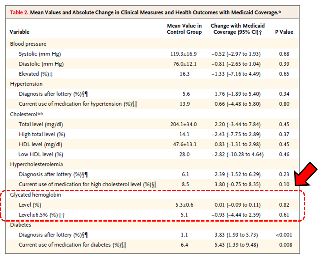
The table blows away a great deal of information. Or maybe not. Based on the information presented I can’t tell. What would be more instructive? Let’s take glycated hemoglobin (GH) levels for example, i.e., the two lines of info enclosed by the dashed red box I added. It would be instructive to see a correlation plot of GH levels at the beginning and end of study for two groups: those who had Medicaid coverage and those who did not. What I have is mind is something like this:
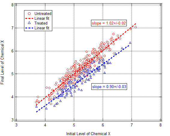
Tabulate regression coefficients, etc. Fine. But show the data. Draw trend lines through the data and show the variation about the trend. Doing so would reveal not only whether there was an effect for those on Medicaid vs those who weren’t but also whether there were differences depending upon what the patient’s initial condition was. If the sample drew from multiple populations a correlation plot might also reveal it. There are many reasons to draw correlation plots. There’s no correlation plot in the paper. I wish there was.
More on the GH numbers in Table 2: The numbers the authors report tell me that the data isn’t normally-distributed. The reported mean GH level in the control group is 5.3% and the st.dev. is 0.6%. Mean + two st.dev. = 6.5%. Remember that number. For a normal distribution 2.5% of the population lies >2 st. devs. from the mean. Table 2 indicates that 5.1% of the control group had GH>6.5%, i.e., twice as many people actually had elevated GH levels than what you’d predict presuming a normal distribution with the report standard deviation. What to make of this? (Can I see a Q-Q plot to assess how non-Gaussian the sample is?) I don’t know other than to say the distribution is obviously non-Gaussian and I’d be very skeptical of conclusions based on the presumption of Gaussian statistics.
Continuing on with that last thought, I’d really like to know how coverage affects those most at risk of diabetes, i.e., those with GH > 6.5%. Who gives a shit about healthy people? Does having coverage improve outcomes of those at high risk of becoming ill? Table 2 indicates that in the Medicaid coverage reduced the fraction of the population with elevated GH levels by 18%. That seems like a meaningful reduction but I’d really like to see the correlation plot I alluded to above to be confident in that.
That’s a lot of rambling on. It’s actually a revised and expanded version of some comments I left on Brad DeLong’s blog this morning. Commenter Charles Broming responds eloquently to my statement about blowing away insight by reducing conclusions to “statistically significant” or “not statistically significant”:
Data needs an explanation. An explanation is a narrative that describes the data’s behavior and posits underlying forces that force the data to behave as it does. Sometimes, this narrative is strictly quantitative (Galileo on falling bodies and Newton on gravity, say) and sometimes its strictly qualitative. Other times, its a combination. Economics and medicine (biology and all its branches) are loaded with qualitative/quantitative explanations.
In this case, the study admits that its authors has no explanation of the data, not that not that they’ve explained the data as Manzi claims.
Yup. Seems to me that’s where things stand.
More to come. @#$%. I’ve got a day job and would like to have a life. I don’t have time for this shit. That said, somebody needs to do it and analyses currently in circulation don’t strike me as sufficient.
(Steve Pizer and Austin Frakt put out a nice analysis of statistical power issues. which – giving it a quick skim – looks good for what it is but I realize that I understand their math in isolation but not how it applies to the Oregon Experiment data. I’m working on it though. It makes sense to me but, as noted above, I’d take a different approach to analyzing the data. More significantly (in the colloquial sense) I’m not aware of any regression-type analysis of the sort I describe above. That doesn’t mean one doesn’t exist. I just haven’t found one.)